Friday, September 23, 2011

Studio 5 : Designing Naturally


Click here to watch video on Studio 5's website - you can read the article there too.


Today so many home trend magazines, catalogs and retail stores are highlighting furnishings and décor that feature the lighter side of the color palette - giving the spotlight to more natural features that seem to eliminate all the fussiness of high-drama decorating. These spaces are often called ‘calming’ and ‘restful’ but sometimes border on, shall we say, boring? Today Designer Lauren Oviatt gives us five no-fail tips to creating fabulous and memorable spaces when heading into “neutral territory.”


In neutral décor, details become the color
When we think about cleansing the palette of a room, so to speak, we are taking away any colors that are too vibrant or strong. Where does the eye go now? The best designers know that design is truly in the details, especially when it comes to neutral spaces. Focus in on the smaller elements of your furnishings and accessories… a leading edge banding on your drapes, the nailhead detail on your sofa or the pleated skirt on your accent chair. It can be a beautiful tassel or fringe on a pillow, the ribbon banding on a lampshade or a subtle placement of ‘found’ objects arranged on a coffee table tray. Paying attention to these details will be the greatest payoff in your neutral space.

**Tip to keep things hip : try to pick details that continue your aesthetic – this will make the details noticeable and not jarring.


Beware of the various shades of neutral
Ever tried to find the color called “white” in a paint deck or the store display?? Doesn’t exist. Just like there are a thousand shades of white, there are also many shades and tints of neutral colors like tan, camel, tobacco, khaki and dove grey, French grey, cool grey, etc. The list goes on. I absolutely believe that layering different neutrals will enhance the character of your room, however, you must pay attention to the undertones of these colors. Adding too many layers of non-harmonious neutrals will muddy your color scheme and defeat the idea of creating calm in your space.

**Tip to keep things hip: A bold and trendy color combination is warm camel with cool grey… you can mix cool shades with warm – the trick with this is that the camel color is rich and deep and the cool grey is a much lighter shade. Contrast is key.


Use nature’s neutral
I am so into greenery! It works in every space no matter your style preference. If you have a love affair with cut flowers like I do, keep a small vase on your sofa table to make the room inviting. More lasting investments would be potted houseplants in your favorite watertight basket or ceramic container. Ever consider a live tree in the corner of the room…? I love this idea because you can only place so many objects in a room or on the walls before it becomes cluttered. Fresh elements like trees, plants and flowers are a terrific way to soften the objects around them while only enhancing their presence.

**Tip to keep things hip: don’t let your pothos swag across multiple pieces of furniture! Keep stems and leaves clipped and neat near the container’s edges.


Think natural elements
With the exception of synthetic fibers, most home décor fabrics come from nature… linen, cotton, velvet, silk, wool, jute and many other readily available fabrics and materials come straight from the ground. Again, think about the details here and get creative using natural, textural elements. Using these different textures will add layers of interest and depth to the space that nothing else ever could. Soft wool broadloom underfoot, silk or taffeta drapery (a personal fave!), cotton velvet pillows and every woman’s bare necessity, a luxurious cashmere throw over your sofa … can you see where I’m going with this? We are creating a space you’ll never want to leave, and we’re only talking texture so far!

** Tip to keep things hip: Edit down to the details and keep things looking neat. It’s like taking off a piece of jewelry before you leave the house. 


Light isn’t just the palette here
I always like to inject a bit of glamour into my clients’ spaces, and when it comes to rooms where the palette is neutral, special consideration must be paid to how light comes into the space. If you have floor to ceiling windows and ten-foot ceilings, lucky you, but many spaces have few windows, natural light coming only from one side of the room, standard eight-foot ceilings and other normal obstacles we all face. I am a huge proponent of incandescent secondary lighting like floor and table lamps, wall sconces and any other light fixtures that have dimming capabilities. Usually when a room “feels good” it’s because it’s well lit and inviting, no matter if the furniture budget was $1,000 or $100,000. Another way to bring light into the space is to bring in mirrors. This tip is as old as the book and works wonders especially in small spaces. Not just wall mirrors but mirrored trays, mirrored furniture or decorative glass objects can instantly add detail and that sparkle factor to a room while visually brightening and expanding the space.

**Tip to keep things hip: Place mirrored accessories directly under or near the light in the room – it creates a stunning look and shoots more light across the room.

Wednesday, April 13, 2011

KSL Segment - Five High-Impact Decorating Ideas


Great segment today.  I loved pulling this together because there are some elements of design that might be considered secondary... today we gave them front-row treatment.


You can watch the segment right here by clicking the window below, or click here to redirect to the video and article on the Studio 5 website.


Florals & Greenery


This time of year aren’t we all dying to bring some bright pops of color into our homes?  From picking up a bunch of tulips at your local grocery store to putting together a more lasting ‘preserved’ bouquet, both fresh and ‘faux’ arrangements add much-desired color and life to your space.  You don’t need a designer sourcebook … it’s easy to find flowers and plants in many shapes and sizes at your local market or garden center.  The best part is – you can customize your selection to fit both your personal style and color palette. 


Drapery


Valances and cornices are great, but I’m talking about floor to ceiling drapery here.  One of the quickest ways to add impact and drama to any space is by installing full-height drapery panels on the windows in a room.  They have an instant ‘coziness-factor’ and add a softness that can’t otherwise be achieved. This is one area where designers know – you get what you pay for.  Spend a little extra time choosing a luxurious heavyweight fabric (note: I didn’t say dark color) and make the smart choice to have them professionally lined and constructed.  You’ll never regret it.


Silver Accessories


While we’re on the topic of no-regret decorating… let’s talk about silver accessories and similar home-décor details. Metallics seem to be the continuing hot-trend, however, sterling silver pieces are like the dependable big brother and create a very similar look.  They are a classically traditional choice that will always be fashionable to display.  Think about collecting sterling silver frames and small jewel-box accessories to display together.  Consider adding eye-catching details like new polished nickel hardware on furniture or built-in cabinetry or shiny new bathroom accessories grouped on a modern silver tray.  Your eye will be drawn to the shiny hits of silver all around the room.


Wallpaper


Nothing creates more high-impact than wallpaper these days.  So often we see photos of stylish rooms designed with at least one wall devoted to some serious wallpaper patterns or similar stenciling.  Talk about drama! I think this trend is a much-needed replacement for the ‘accent wall’ of the 90’s. Do : wallpaper in small doses but maximize the impact by choosing a bold stripe, geometric or floral.  Don’t : wallpaper or stencil every room in your house just because it’s on-trend.  You’ll scare off the neighbors.


Paint


Re-painting any room is an easy and surefire way to add impact.  Paint selection is one of the most important decisions you will make when pulling a room together and can easily make or break any space in my opinion.  A well-chosen wall color makes everything in the room sing while the wrong color choice has a horribly negative affect on both the furniture in the room and the people who live there!  My tip here is test, test, test! Paint swatches on all four walls and check the color at all times of day and especially under lamp light at night.  Paint isn’t permanent, but it can be a time-consuming process so do your homework first.  Log on to Oviatt-Pratt & Associates’ Facebook page for six of my favorite foolproof paint colors.

Wednesday, July 28, 2010

Utah Style Photo Shoot

Brad Mee and Tessa Woolf of Utah Style

We recently participated in a photo shoot of one of my historical projects. It was great to be a part of the process of setting and staging shots for a magazine. We had a wonderful time with the team from Utah Style & Design, Brad Mee, Tessa Woolf, and photographer Scot Zimmerman. This project will be featured in two up coming issues of Utah Style magazine, Winter 2010 and Summer 2011. For a bit of a sneak peek, read about it in Utah Style's Blog here. (Yes, that's me behind the Gladiolas on the kitchen Island.)

This project allowed me to flex my historical style muscles. Recreating the past is my niche in the design world. I'm excited to share what I was able to create on this project with others.
Derek

Monday, June 7, 2010

KSL Segment- Adding Energy to Your Home

I did a segment on Studio 5 this morning - the topic was "Adding Energy to Your Home" - I had a great time developing the segment, there were so many ideas flowing but I tried to keep it organized and easily understood! You can watch the clip below or click here to go right to ksl's website. My article is below as well.


While “all white” kitchens and neutral spaces are still very much a current trend in home design, the summer season calls for a boost of energy. “Our spaces should be a reflection of our attitude; in the summer we feel energized and happy,” says designer Lauren Oviatt. Today Lauren shares her tips on infusing energy into boring spaces with the use of bright color choices, exciting patterns and fresh greenery and flowers.

*Go Graphic: Swap the tired muted floral fabrics for pops of color and graphic pattern. Not only will the contrast in color transform the space, but the movement of the pattern is also a huge part. Look for patterns with an overall bolder, larger scale.


*Pick One Color: Don’t be intimidated thinking you have to come up with an entirely new color scheme for your room, this can be stressful and very expensive. Instead, pick your favorite color, (yes just one!) and use it in different ways throughout the room. You might place blue pillows on the sofa, a blue tray on your coffee table, and a couple new blue ceramic pieces in your bookcase.


*Start with Neutrals: It’s okay to use the word ‘neutral’ here. Strip your room down to its most basic form to have a blank slate for inspiration, but don’t worry if your sofa is of a certain color. No need to rush out and buy all new cream and beige furniture. Any pieces covered in solid-looking fabrics will become your neutrals as you add louder, more colorful accents. Trust me.


*Swap Accessories: Many people can’t commit to large furniture pieces or drapery in bold color… no problem! Use the simple trick of replacing black or dark accents (picture frames, urns, candlesticks, other decorative accessories) with colorful pieces and instantly you’ve altered the color scheme. The trick here is to pare down before you add new accessories. Make room for the new color by eliminating the visual clutter of the “blah”.


*Use Nature’s Great Neutral: The quickest way to bring energy into any space is by placing fresh cut flowers or other live plants around your home, simply because they’re living things! Plus, there is no easier time than summer to find great-looking plants and keep them thriving. Plants instantly breathe life into even the dullest spaces. Have you ever noticed how greenery goes with everything? It truly is nature’s great neutral. Use live plants and flowers liberally to achieve fresh, invigorating spaces.

Friday, May 21, 2010

KSL Segment - Picture Perfect Placement

Friday shows are so fun!  The studio had this bright and relaxed feeling today - usually there are guests shuffling in and out and a bit of organized chaos, but today made tv look so easy. The segment was on Picture Placement and I was happy for the opportunity to provide a few tips on this very misunderstood subject. Here is my video and write-up - or you can click here to be directed to the page on KSL's website.


When taking on a room re-do, many people begin filling out the space in their homes by hanging photos and art on the walls. You might already have some art you like or brought with you from an earlier place and time. And additionally, it can be an inexpensive way to dramatically change a room. Warning: While it may seem one of the easier décor jobs to tackle, many still get it wrong. Pictures are often hung too high, are mis-matched, or seem to fight with existing décor. Today, designer Lauren Oviatt gives us her tips on perfect picture placement.


1. Use the right tools:
Before you begin a hanging project, consider what you’ll be hanging and the required tools to make sure your frame is secure and level. Here are some basic hanging tools to keep on hand:
Level, hammer, ruler/measuring tape, nails, picture hangers, d-rings and picture wire, drywall anchors (for architectural fragments), toggle bolts & expanding bolts (for heavier pieces).
When in doubt about the weight of your art piece or the security of your nail, find a stud. Studs are typically framed at 16” widths, but an inexpensive stud finder will eliminate guesswork.


2. Consider alternatives:
Instead of hanging all your photographs/art on nails covering bare walls – consider alternatives. Group eclectic frames and photos by using frame rails, available at home stores or through catalogs. Try to mix small and large frames on each rail to create visual balance. If your home has decorative wainscoting or other architectural details featuring a shelf top, simply set pictures along the trim – it creates a gallery effect and is easily changed without damage to walls. Ribbon treatments are suitable for many areas and can be a custom feature in children’s rooms and more decorative spaces.


3. Maintain One Unifying Element:
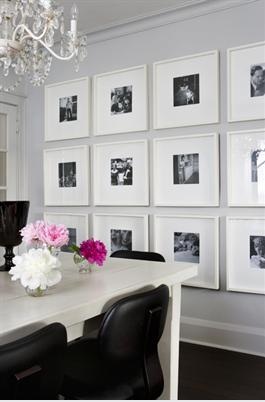
When planning a grouping of art or photographs, keep consistency among at least one element of your design. If you have various sized photographs, make sure they have similar mats and frames. Conversely, if your ‘material’ is all very similar in subject, think outside the box with varying frame styles and sizes. Just about everything benefits from being hung in multiples – if you are wary of messing up, lay pictures out on the floor to get an idea of the arrangement you’ll like.


4. Frame for the piece, not the space:
A tip I learned from a framer years ago is this – always frame for the piece, not the space where the piece will be hung. This is a no-fail universal rule. The photo or art will always be showcased if it is framed according to the subject… this rule ensures that your investment on proper framing will last a lifetime.

5. Tips from the Pros:
Back to common mistakes – pictures are often hung too high, much too high in fact! Art galleries employ the rule of hanging pieces so their center is at eye level – or between 58 and 60 inches from the floor. This is a great place to start. Also, many rooms have well-thought out groupings, but they seem to float high above furniture pieces, creating a visual disconnect instead of harmonious focal point. Try pieces 6-8 inches above existing furniture groupings and notice how the vignette seems to come together. Last but not least, consider the size of the frame when hanging groupings. The width of the frame (and sometimes the mat as well) will give you a hint as to the spacing of the pieces. Separating pieces too far apart defeats the purpose of a ‘grouping’.