Monday, June 7, 2010

KSL Segment- Adding Energy to Your Home

I did a segment on Studio 5 this morning - the topic was "Adding Energy to Your Home" - I had a great time developing the segment, there were so many ideas flowing but I tried to keep it organized and easily understood! You can watch the clip below or click here to go right to ksl's website. My article is below as well.


While “all white” kitchens and neutral spaces are still very much a current trend in home design, the summer season calls for a boost of energy. “Our spaces should be a reflection of our attitude; in the summer we feel energized and happy,” says designer Lauren Oviatt. Today Lauren shares her tips on infusing energy into boring spaces with the use of bright color choices, exciting patterns and fresh greenery and flowers.

*Go Graphic: Swap the tired muted floral fabrics for pops of color and graphic pattern. Not only will the contrast in color transform the space, but the movement of the pattern is also a huge part. Look for patterns with an overall bolder, larger scale.


*Pick One Color: Don’t be intimidated thinking you have to come up with an entirely new color scheme for your room, this can be stressful and very expensive. Instead, pick your favorite color, (yes just one!) and use it in different ways throughout the room. You might place blue pillows on the sofa, a blue tray on your coffee table, and a couple new blue ceramic pieces in your bookcase.


*Start with Neutrals: It’s okay to use the word ‘neutral’ here. Strip your room down to its most basic form to have a blank slate for inspiration, but don’t worry if your sofa is of a certain color. No need to rush out and buy all new cream and beige furniture. Any pieces covered in solid-looking fabrics will become your neutrals as you add louder, more colorful accents. Trust me.


*Swap Accessories: Many people can’t commit to large furniture pieces or drapery in bold color… no problem! Use the simple trick of replacing black or dark accents (picture frames, urns, candlesticks, other decorative accessories) with colorful pieces and instantly you’ve altered the color scheme. The trick here is to pare down before you add new accessories. Make room for the new color by eliminating the visual clutter of the “blah”.


*Use Nature’s Great Neutral: The quickest way to bring energy into any space is by placing fresh cut flowers or other live plants around your home, simply because they’re living things! Plus, there is no easier time than summer to find great-looking plants and keep them thriving. Plants instantly breathe life into even the dullest spaces. Have you ever noticed how greenery goes with everything? It truly is nature’s great neutral. Use live plants and flowers liberally to achieve fresh, invigorating spaces.

Friday, May 21, 2010

KSL Segment - Picture Perfect Placement

Friday shows are so fun!  The studio had this bright and relaxed feeling today - usually there are guests shuffling in and out and a bit of organized chaos, but today made tv look so easy. The segment was on Picture Placement and I was happy for the opportunity to provide a few tips on this very misunderstood subject. Here is my video and write-up - or you can click here to be directed to the page on KSL's website.


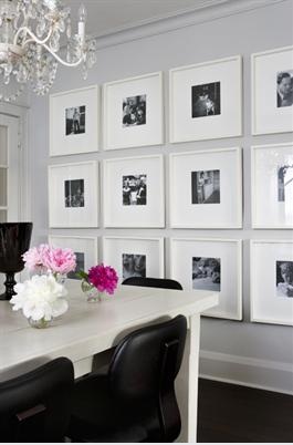
When taking on a room re-do, many people begin filling out the space in their homes by hanging photos and art on the walls. You might already have some art you like or brought with you from an earlier place and time. And additionally, it can be an inexpensive way to dramatically change a room. Warning: While it may seem one of the easier décor jobs to tackle, many still get it wrong. Pictures are often hung too high, are mis-matched, or seem to fight with existing décor. Today, designer Lauren Oviatt gives us her tips on perfect picture placement.


1. Use the right tools:
Before you begin a hanging project, consider what you’ll be hanging and the required tools to make sure your frame is secure and level. Here are some basic hanging tools to keep on hand:
Level, hammer, ruler/measuring tape, nails, picture hangers, d-rings and picture wire, drywall anchors (for architectural fragments), toggle bolts & expanding bolts (for heavier pieces).
When in doubt about the weight of your art piece or the security of your nail, find a stud. Studs are typically framed at 16” widths, but an inexpensive stud finder will eliminate guesswork.


2. Consider alternatives:
Instead of hanging all your photographs/art on nails covering bare walls – consider alternatives. Group eclectic frames and photos by using frame rails, available at home stores or through catalogs. Try to mix small and large frames on each rail to create visual balance. If your home has decorative wainscoting or other architectural details featuring a shelf top, simply set pictures along the trim – it creates a gallery effect and is easily changed without damage to walls. Ribbon treatments are suitable for many areas and can be a custom feature in children’s rooms and more decorative spaces.


3. Maintain One Unifying Element:
When planning a grouping of art or photographs, keep consistency among at least one element of your design. If you have various sized photographs, make sure they have similar mats and frames. Conversely, if your ‘material’ is all very similar in subject, think outside the box with varying frame styles and sizes. Just about everything benefits from being hung in multiples – if you are wary of messing up, lay pictures out on the floor to get an idea of the arrangement you’ll like.


4. Frame for the piece, not the space:
A tip I learned from a framer years ago is this – always frame for the piece, not the space where the piece will be hung. This is a no-fail universal rule. The photo or art will always be showcased if it is framed according to the subject… this rule ensures that your investment on proper framing will last a lifetime.

5. Tips from the Pros:
Back to common mistakes – pictures are often hung too high, much too high in fact! Art galleries employ the rule of hanging pieces so their center is at eye level – or between 58 and 60 inches from the floor. This is a great place to start. Also, many rooms have well-thought out groupings, but they seem to float high above furniture pieces, creating a visual disconnect instead of harmonious focal point. Try pieces 6-8 inches above existing furniture groupings and notice how the vignette seems to come together. Last but not least, consider the size of the frame when hanging groupings. The width of the frame (and sometimes the mat as well) will give you a hint as to the spacing of the pieces. Separating pieces too far apart defeats the purpose of a ‘grouping’.

Friday, May 14, 2010

Small house makeover.

Taking a small little house that's listed on the city's historical register and giving it a new life can be an adventure. Granted the owner had the responsibility of working with the historic committee, so ultimately his adventure was greater than ours. It began with this boarded up little shack.

It made it onto the registry due to its unique double entrance. Frankly I think this is just an early example of a duplex. So our first task was to get permission to eliminate one of the doors. So we proposed this new look for this little house.

After making a few concessions for the Historic committee, construction began.

After many weeks of hard work including all the renovations that took place on the inside. This little house got a new lease on life.


Friday, April 2, 2010

KSL Segment - Balance

Click here to watch the segment on Studio 5's website or watch the video and read my web article below.


Among the methods designers employ to achieve beautiful rooms, balance is one of the most important. Before a room can be or feel ‘complete’, a sense of balance must be present. Designer Lauren Oviatt is here today giving us five points to consider when trying to achieve that perfect balance in your space.


1. Color:
One of the simplest ways to balance a room is to carry the same color throughout. Many people don’t know this, but certain colors will read the same to the eye as it scans a room… don’t be so hung up on having the exact shade of blue on the pillows, drapes, rug and decorative accessories. The more slight variations you have off your ‘main’ color will make things more interesting and less contrived. Another tip: combine the use of lights and darks – using equal amounts of cool and warm colors is effortless balance: achieved.


2. Space Planning:
Space planning is huge and something a designer’s expertise can facilitate! To create balance you MUST think not only about the appropriate use of space throughout the room, but also the scale and size of the pieces you’ll be using. You’d never be happy having huge upholstered pieces in a small room (no room for side tables, lamps and accessories) and likewise a room with fifteen foot ceilings would feel empty with furniture and pieces that are too small.
Tip:When considering a floor plan, start by placing your furniture in the middle of the room and work toward the walls. You'll get a more exciting result.


3. Repetition:
In any space use the element of repetition to create balance. This can be in the display and use of certain shapes, motifs, colors or finishes. In a room where the palette is neutral or light overall, use dark hardware on furniture pieces, a dark lampshade, and dark frames for your artwork to draw the eye around the room and ‘connect the dots’ so to speak. The repetition of these things is harmonious and reflects a certain attention to detail without trying too hard.


4. Light Control:
Think about the placement of lamps and alternate lighting that you’ll use in the evening. Create balance by placing lamps on a sofa table in one part of the room and a floor lamp that sits by a reading chair on the other side. That desirable ‘ambient glow’ is often maximized by the use of dimmer or three-way switched fixtures that can be matched at the same level. If you have a room with glaring windows all along side, think about placing a mirror on the opposite wall to move the light around the room.


5. Room to Room:
Many of today’s homes have Great rooms that adjoin different seating areas. Carefully consider how you’ll design and decorate these rooms to reflect the balance you’d work so hard for in a singular room. Carry color or certain textures throughout; although these spaces have different functions, you should consider them as different parts that must make up a harmonious whole.

Wednesday, March 17, 2010

KSL Segment - Not Your Grandma's Decor


(click here to watch on ksl's website)

In 2010, a new home décor trend is coming from an unexpected place: your grandma’s house. Believe it or not, there is a noticeable emerging style that revolves around pieces you might remember from your grandmother’s house. It’s a style that, at its core, revolves around creating more comforting spaces - implementing vintage pieces like patchwork quilts, hooked rugs, needlepoint and even chintz fabric. One L.A.- based designer described it well when he said, “more American pie, less flash in the pan.” Today designer Lauren Oviatt is here to break down this trend and show you ways to make this style a part of your own home.

For the last several seasons we’ve been talking about trends like “transitional” and “contemporary” – I’m not saying those trends are going away any time soon; however, those styles may not be as easy to implement as people would hope. It’s easy to look at a stylish glossy magazine photo and fall in love with the décor in the picture; it seems cool with all the sleek finishes, bold colors and fancy furniture pieces. Most of the time, though, we’re working a sofa we’ve had for a while – or – a lifestyle that isn’t so conducive to white linen sofas and mirrored furniture. Having this new trend that reflects back on a comfortable way of living is refreshing in its simplicity.

1. Color Schemes
One of the biggest keys to successfully pulling off this ‘grandma’ style is to be careful of antiquated color schemes. Choose color palettes that have bright pops of color and other more trendy shades, chartreuse, aqua, mustard yellow and coral (not all at once per say). The safest bet is to look for patterns with light or white backgrounds… guaranteed to look current and fresh.


2. Texture
When we speak of ‘comfortable living,’ we immediately picture deep sofas and chairs, soft pillows and cozy blankets. Nothing is more ‘grandma’ than a crocheted throw or needlepoint pillow…don’t be afraid to try them. However, don’t get sloppy. Whereas our grandmas may have thrown a blanket over the back of the sofa or draped it casually over a chair – a more clean approach for today’s homeowner would be to place a neatly-folded throw over the arm of a chair or the end cushion of a sofa, gently cascading over the front.


3. Making it Personal
You may have hand-me-downs from grandma or your own parents that you’d like to display. Make it personal! Displaying heirlooms in your home is not only a great way of remembering the past but also, the items become conversation pieces and create tons of character. Not into antique pictures? Try displaying old clocks, hang plates on the wall in an interesting configuration, or give display space to anything you have a collection of. If you don’t have family heirlooms (or don’t like what you’ve been given), find a way of making your own. Someday you’ll be passing it on to your children.


The key to remember is that this ‘grandma’ style doesn’t have to be out of date. My advice is to try it in small doses – a throw here, a picture there… and don’t throw good design out the window.